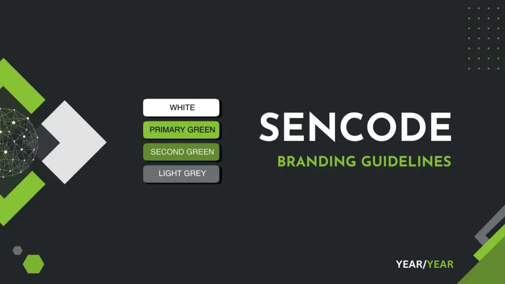
The Sencode name, logo, and brand assets are the property of Sencode Ltd and are protected by intellectual property laws. Unauthorised use, modification, or reproduction of these assets is strictly prohibited. These guidelines ensure proper and consistent use of the Sencode brand by authorised individuals or organisations.
Logo Usage
Sencode has multiple logo variations to suit different contexts. The default logo for most use cases should be the SVG or PNG version without the slogan.
Default Logo (No Slogan)
- Formats: SVG (preferred), PNG (for web where SVG is not supported)
- Orientation: Use stacked for narrow spaces or vertical alignment needs
Available Logo Files
| File Name | Description |
|---|---|
| Branding Logos SVG.zip | Full set of logos in SVG format with slogan |
| Branding Logos SVG No Slogan Stacked.zip | Default SVG version (no slogan, stacked) |
| Branding Logos SVG Stacked.zip | Stacked logo with slogan |
| Branding Logos PNG.zip | Full set of logos in PNG format with slogan |
| Branding Logos PNG Transparent.zip | Transparent PNG logos with slogan |
| Branding Logos PNG Transparent No Slogan Stacked.zip | Default PNG version (no slogan, stacked) |
| Branding Logos PNG Transparent Stacked.zip | Transparent with slogan, stacked |
| Branding Logos JPG.zip | JPG versions for general use (non-transparent) |
Logo Usage Guidelines
- Always use the no slogan version by default unless context requires the full version.
- Maintain clear space around the logo (at least the height of the “S”).
- Do not crop, recolour, stretch, or modify the logo.
- Use SVGs for digital and print, PNGs for web, and JPGs only when transparency isn’t needed
Logo Usage Rules:
- Maintain clear space around the logo to preserve its visibility.
- Do not distort, rotate, recolour, or crop the logo.
- Use the correct version depending on the background contrast.
Colour Palette
Our brand colours reflect our commitment to clarity, security, and professionalism. Use them consistently across all visual assets.
| Colour Name | Hex Code | RGB | Usage |
|---|---|---|---|
| Primary Green | #86c232 | (134,194,50) | Highlights, icons, buttons, call-outs, primary headings, dividers |
| Secondary Green | #61892f | (97,137,47) | Buttons, secondary headings, accents |
| Charcoal | #222629 | (34,38,41) | Backgrounds, dark UI elements |
| Slate | #474b4f | (71,75,79) | Subtle accents |
| Light Grey | #6b6e70 | (107,110,112) | Secondary text, dividers |
| White | #FFFFFF | (255, 255, 255) | Body Text |

Example Use Cases (as seen above):
- Use Primary Green (
#86c232) for icons and highlights, primary headings on dark backgrounds. - Use White (
#FFFFFF) for body text over dark backgrounds, primary headings on dark backgrounds. - Charcoal (
#222629) works well for main backgrounds.
Example Image Using Guidelines

Typography
Primary Typeface: Use a clean, modern sans-serif font such as Helvetica.
Logo Typeface: Josef Sans Bold
Usage:
- Headings: Bold, use
#ffffffor#86c232depending on the contrast. - Body Text: Regular, use
#6b6e70or#ffffffon dark backgrounds. - Maintain consistent font sizing hierarchy for readability.
Imagery and Iconography
- Use simple, flat icons in
#86c232or#ffffff. - Imagery should communicate clarity, technology, and security.
- Avoid overly complex or abstract visuals.
Tone of Voice
- Professional yet approachable
- Clear and jargon-free, especially when addressing non-technical users
- Confident, without exaggeration
Do’s and Don’ts
Do:
- Use consistent spacing and alignment.
- Use brand colours purposefully.
- Keep visual elements balanced and clean.
Don’t:
- Use unauthorised versions of the logo.
- Apply brand colours in clashing combinations.
- Overuse icons or animations that distract from key content.
Contact
If you are in any doubt, please contact the team at [email protected]. A member of our team will be able to clarify any issues you may have. If you need custom logos, please reach out.